Phablet.
It's the worst word, a word only spoken with an apology — or maybe with a proviso. "I hate saying this word, but it's the only way to describe this thing." But it's just a word. And like all good words, it accurately connotes the thing you want to reference. It's more economical than "gigantic phone" and, honestly, more accurate. A phablet is not a phone; it's something else.
In fact, there's a certain satisfaction in using it. When a word not only refers to a thing but also itself feels just as unwieldy as that thing, that is a good word. A powerful word, a word that gets things done and isn't worried about how silly it looks doing it.
The Nexus 6 is a phablet.
It's also the showcase for the newest version of Android, 5.0 Lollipop. As with other Nexus devices, it will likely be one of the only phones to run Android without extra, unwanted software you get from carriers and manufacturers. That's a big deal for some people. Assuming you aren't put off by the size or the $649 off-contract pricing. Assuming that you don't really want just a phone.
Because the Nexus 6 isn't a phone. It's a phablet.
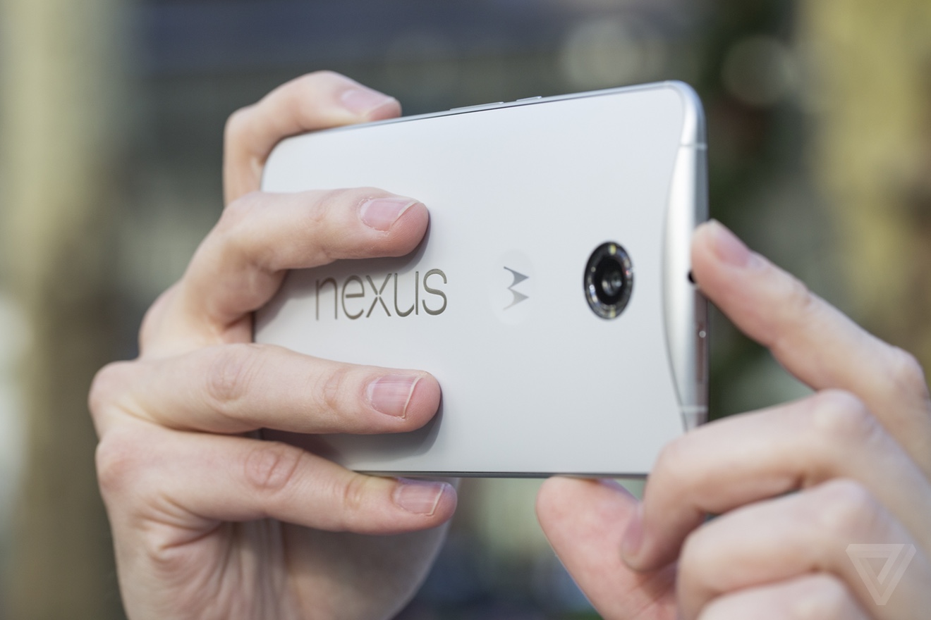
The Nexus 6 is taller, wider, and thicker than either the iPhone 6 Plus or the Samsung Galaxy Note 4. That's in large part because the Nexus 6 has a larger screen, at about 6 inches diagonal. It's also pretty thick, sloping from a thinner edge around the bottom and sides to 10mm near the top. The Nexus 6 is essentially a blown-up version of the Moto X, and so it shares almost all of its design language.
I'm not sure I agree with that design choice. Both phones have a gentle curve on the back and a nice "dimple" in the center where you can rest your finger. The two combine to make a device that is designed more to nestle in your hands than feel slim in your pocket. There's something admirable about Motorola's clear and consistent design vision for its devices, but at this size it starts to break down. I can't help but wonder whether there's wasted space inside it.
It feels great in two hands, not so much in one pocket
Unlike the Moto X, the back on the Nexus 6 is plastic, I have the white model that is probably best described as having an "eggshell" kind of feel and color. It's smooth without being glossy and so far has resisted both scratches and discoloration. The power and volume buttons are thankfully located in a humane position on the right of the device, reachable with your thumb. It looks a little weird, and I still hit the wrong button sometimes despite the differentiated etching on the power button, but it works.
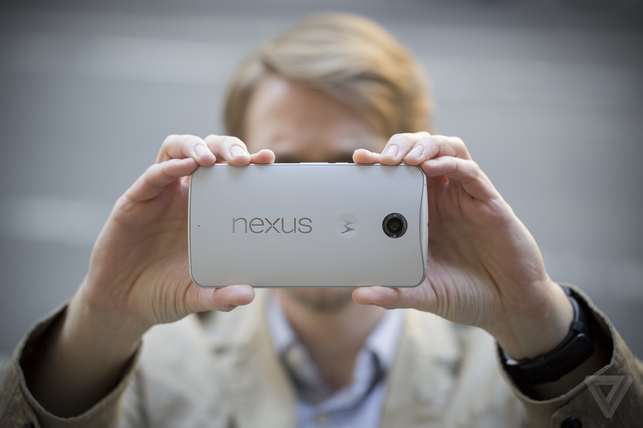
Just so I'm super clear: the only time you can really use this phablet one-handed is when you're just scrolling through a web page or an ebook with your thumb. For everything else, accept that it's a phablet and you're going to use two hands.
Unlike its smaller sibling, the Moto X, the Nexus 6 has two front-facing speakers. They are loud. Once I accidentally put the phone up to my ear when Google Now was about to speak in its Outside Voice, and I damn near damaged my eardrum. Still, these won't replace your Jambox: at high volumes it can begin to sound a little tinny. But if the only phone that beats you in terms of sound quality and volume is the HTC One M8, you're in good company.
Let's get back to the screen, whose size is really the whole reason for this phone's existence. The resolution on the 6-inch screen is 1440 x 2560, which at 493ppi sits between the iPhone 6 Plus and the Note 4 in terms of pixel density. But whatever, the pixels are tiny and even if you go hunting for them, you won't find them. Crazy world we live in, but this kind of "Retina Plus" pixel density is table stakes now.
Living with a giant-screened phablet takes some getting used to, but it’s nearly impossible to go back once you do. So many of the foibles of smartphones become lessened or eliminated simply because there’s simultaneously more space on the screen and many of those things are bigger and easier to tap. It’s easier to show stuff on your phone to other people, it’s easier to turn it into a reading and movie-watching gadget, and it’s way easier to type on.
The screen is very good, but it also comes with its own peculiar set of tradeoffs. Tuning the color on AMOLED screens to match what most people actually want is notoriously hard, and, to its credit, Google has landed on settings that don't oversaturate colors or look too dim. Nitpickers will notice a very subtle color shift when you tilt the phone left to right, especially on whites. If you’re a nitpicker, there’s your barely-visible-to-the-eye nit.
But that's a tradeoff I'm willing to make to get a new feature in Lollipop called "Ambient Display" that pops up your notifications as they come in without powering on the entire screen. It’s essentially an extension of what Motorola did before, but on stock Android it just shows your entire lockscreen - albeit in black and white, which saves power.
Battery life is good by phone standards, but maybe only fair by phablet standards. The Nexus 6 has a 3220 mAh battery, which in my week or so with the device initially lasted a solid day and a half. Very heavy use did make it die out after 14 hours or so, while lighter use let me push it to two days. I'd say that battery life seems a little inconsistent, but really I can’t judge yet even after a week of using it. For one thing, the software may not be final, but the real problem is that I’m just seeing completely different results day by day.
The bottom line, though, is that you shouldn’t have a problem lasting through an entire day — for a phablet, I’d like to see that the number consistently reach into the next morning. There is a battery saver mode (finally) built into Android now, which limits some features and turns off background data. It also turns the menu and button bars an aggressive shade of orange. If you happen to have the included fast charger (or anything that can pump out more voltage than a standard USB charger), you can add a few hours of charge in just 15 minutes.
All day battery, but maybe not much more
If I have any complaints about the performance of the Nexus 6, they hopefully stem from the fact that I'm not yet using the build of Android that will come on retail devices. Everything from scrolling to app launching to games is mostly smooth and snappy thanks to the 2.7GHz quad core Snapdragon 805 processor and 3GB of RAM. That is, everything is fast until it's not — I'm getting intermittent and infuriating pauses in certain tasks. The new multitasking "Overview" screen and the camera in particular can inexplicably lag for a second or more. Google's Android team assures me that this is not normal, and I'm dearly hoping they're right: excepting those pauses, the Nexus 6 is super fast. (An OS update was pushed out the night before this review was published, but I haven’t received it yet.)
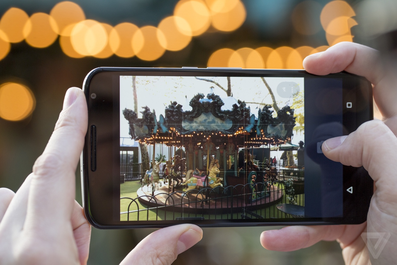
My initial impressions of the camera were that it was the best that's ever shipped on a Nexus device. After using it quite a bit more, I can unequivocally say that's true. But that's also not saying very much, since past Nexus cameras have been consistently bad. This 13-megapixel sensor seems like it's identical to the one found in the 2014 Moto X, but with stabilization.
The camera app feels a little spartan
In good light, it's able to get shots decently fast and the results are sharp. But even with OIS, low light can be a little bit of a challenge — though again, even a thoroughly average phone camera in 2014 is a win if you're grading on the Nexus curve. It doesn't hold up to the best that Samsung and Apple can do, but it shouldn’t cost you many shots either. One thing I find curious is the Google Camera software, which lacks features like slow motion video, time lapse, and all those built-in image effects. Theoretically, the new APIs that Lollipop gives to developers will mean that a third-party camera app will be able to fill in those gaps, but it would still be better just to have them in the default app.
Android 5.0 Lollipop is the biggest change to the operating system in years, thanks to a complete visual overhaul and a giant pile of little features. It’s a lot like what Apple did to iOS last year with iOS 7. Lollipop is based on a concept called "Material Design", which imagines a world of magic paper underneath your screen. It consists of cards, textures, and buttons that will be familiar to anybody who has used Google Now — plus an incredibly bright and vibrant set of colors that are a wild departure for Android. You could call it skeuomorphism if you really wanted to, but the reality being imitated here is more Oz than Kansas.
Essentially, there are no more panes of virtual shadowed glass and neon outlines in Android anymore. Apps (and even browser tabs) become giant cards in an overview, the apps button on the home screen grows out to become a sheet of paper on which your programs sit, and compose buttons float around on the bottom of the screen.
If it sounds a little discombobulating, don't worry, it actually feels coherent and logical. Animations throughout the whole system help you keep a sense of place — though once you get used to it, you'll wish that they would speed up a little bit. (Nerds take note: there are developer options that do just that.)
The improved notifications alone make Lollipop a good update
Notifications appear properly on the lock screen now, where you can directly interact with them. There's a deep (and convoluted) set of options for altering which notifications are allowed and where, too, if you're worried about privacy. Google added a new "Priority mode," which functions basically like a Do Not Disturb mode with granular controls over what apps can bug you during meetings — and there's a default time-out you can set so you won't miss stuff later in the day.
But for hardware that's so clearly more phablet than phone, the software sometimes feels like it didn't get the memo. Android can work great on a large screen, but it helps if there are accommodations for all the extra real estate. Yet on the Nexus 6, the home screen doesn't rotate, for a start, and core apps like Gmail don't offer a two-pane view in landscape. I'm not asking for tricks to make one-handed use better (though they wouldn't hurt), but I am asking that Android do more than just give me a bigger view with more stuff in it.
Android Lollipop couldn’t ask for a better showcase than the Nexus 6. I do wish that the software did a better job helping me manage a device this large, but the fundamental improvements to the already excellent notification system have made me more productive already. Assuming Google can work out these first-release bugs, Lollipop itself could be fast enough and pretty enough to spur Android developers to finally pay more attention to design in their apps.
Whether the Nexus 6 will be more than a showcase is an open question. Nexus phones always seem to have some sort of weird sales strategy that limits their adoption. The last couple of phones have been incredibly inexpensive, but lacked carrier support. The Nexus 6 flips that script: it has the support of the big carriers in the US, but it’s no longer a cheap phone at $649 off contract. So the story of the Nexus may remain unchanged: popular with enthusiasts, but a curiosity for everybody else.
If nothing else, that carrier support means that you can check out the size for yourself in a store. If you do, don’t be shy about really hanging out with the Nexus 6 for as long as possible. Using the Nexus 6 is absolutely awkward. Until, strangely, it's not. When I show this phablet to people, I get the same glassy-eyed "I don’t need this" look that I used to get when I showed them my big, honking pre-iPhone smartphone all those years ago. They all converted. You just might do the same.
:format(webp)/cdn.vox-cdn.com/uploads/chorus_asset/file/25287583/DSC06615.jpg)
:format(webp)/cdn.vox-cdn.com/uploads/chorus_asset/file/25286103/DSCF6450.jpg)
:format(webp)/cdn.vox-cdn.com/uploads/chorus_asset/file/25274108/DSCF4193_Enhanced_NR.jpg)
:format(webp)/cdn.vox-cdn.com/uploads/chorus_asset/file/25270766/247013_Linxura_smart_control_JTuohy_0006.jpg)
Share this story